Page 6 of 13
Posted: Fri Jun 03, 2016 1:06 am
by dissolute
They should have used some of the artwork from the original comics as the cover art!
By the way, did they ever get the rights to re-release the comics in a bound edition?
Posted: Fri Jun 03, 2016 6:20 am
by Spaceship Dispatcher
dissolute wrote:They should have used some of the artwork from the original comics as the cover art!
By the way, did they ever get the rights to re-release the comics in a bound edition?
They're advertising the book, so I believe they have.
Posted: Fri Jun 03, 2016 7:56 am
by Alan
Yes, published in November.
Posted: Fri Jun 03, 2016 11:45 am
by denis rigg
Agree, the cover of second volume looks a lot better than the first, despite that it is carried out in a simple manner. Good set of colors and a kind of stylization. But must admit, when I first saw it (cover of second volume), I decided on moment that it is scan of the back side of the editions "Steed and Mrs. Peel".

Posted: Fri Jun 03, 2016 9:55 pm
by Alan
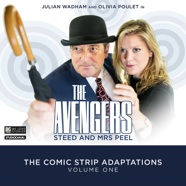
The only worry I have is that the first volume was publicised with one design and then released with another, so I'm not sure quite how final that Volume 2 design might be.
First design:

Actual release:
Posted: Sat Jun 04, 2016 11:03 am
by denis rigg
Alan wrote:The only worry I have is that the first volume was publicised with one design and then released with another, so I'm not sure quite how final that Volume 2 design might be.
First design:
Actual release:
Yes, quite possible, Alan, that change for design of current cover of second volume will happening too.
Curiously, the first design of the volume one I like more than the actual release. Well, first design is done in a good-natured manner, soft colors, evokes past times, when actual release of cover - Avengers style brings very little at all. But this is only a single cover of Avengers from Big Finish, which I do not like.

Others: John Steed and David Keel (very well, or at worst - neutral, but never not bad).
Posted: Sat Jun 04, 2016 4:04 pm
by Alan
Yes, I definitely prefer the first design for Volume 1. I find it hard to put the level of my dislike for the replacement into words without them being unprintable...
Posted: Sat Jun 04, 2016 11:55 pm
by mrs_emma_peel
I agree, its an absolutely terrible cover for Vol 1, just daft comedy poses with no TV inspired thriller creativity - Steed's bowler looks ridiculously too big and even his umbrella is smooth handled - cardinal sins.
The Return To Castle Death episode is far too manic - almost hysterical at times - what happened to the compelling thriller tone? Have the writers really studied the spirit series 4?
The Vol 2 silhouette image is an improvement and looks more serious. I hope they keep it. The Dr Who covers are so much superior.
Posted: Sun Jun 05, 2016 9:28 am
by dissolute
You would think they could afford a bowler that actually fits Julian's head.
Posted: Sun Jun 05, 2016 11:32 am
by Alan
mrs_emma_peel wrote:The Return To Castle Death episode is far too manic - almost hysterical at times - what happened is the compelling thriller tone? Have the writers really studied the spirit series 4?
I'm assuming that since these comics hail from a period that coincides with Series 5, it's that season that the tone is based on.
However the source material being designed for children rather than an adult/family audience has hamstrung the productions in my opinion, and the tone and level of sophistication is way below The Avengers usual. I don't think that's a problem with the scripting, rather it is with the source material which is pretty infantile at times.
The Diana comic strips' good reputation is, IMO, almost entirely down to the quality of the artwork, which is definitely the best from the time of the series transmission. The stories, though, are exactly what you'd expect from a children's comic.